Corporate LinX - Documentation Library
Accessing our Content Management System
Our Content Management System (CMS) sits under the Admin tab as this is predominantly used by admins.
Once you have successfully logged into the portal, you can access the page by hovering over the “Admin” button in the navigation bar and clicking “Content Management” button.
The UI
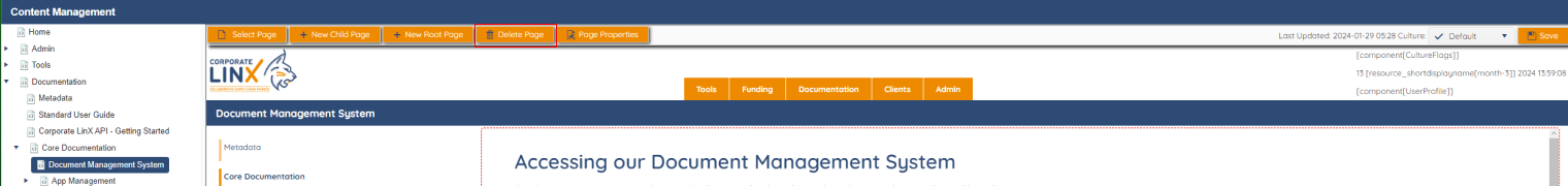
When you access the page, you’re greeted with something that looks like this:
Like with DMS, when you first access this page, there appears to be nothing on it. However, as you can see on the left, there’s a list of all the pages in the portal. To view a page’s content you select it from the list. For example, expanding “Documentation” and then expanding “Core Documentation” then selecting “Document Management System” will bring up a page that looks something like this:
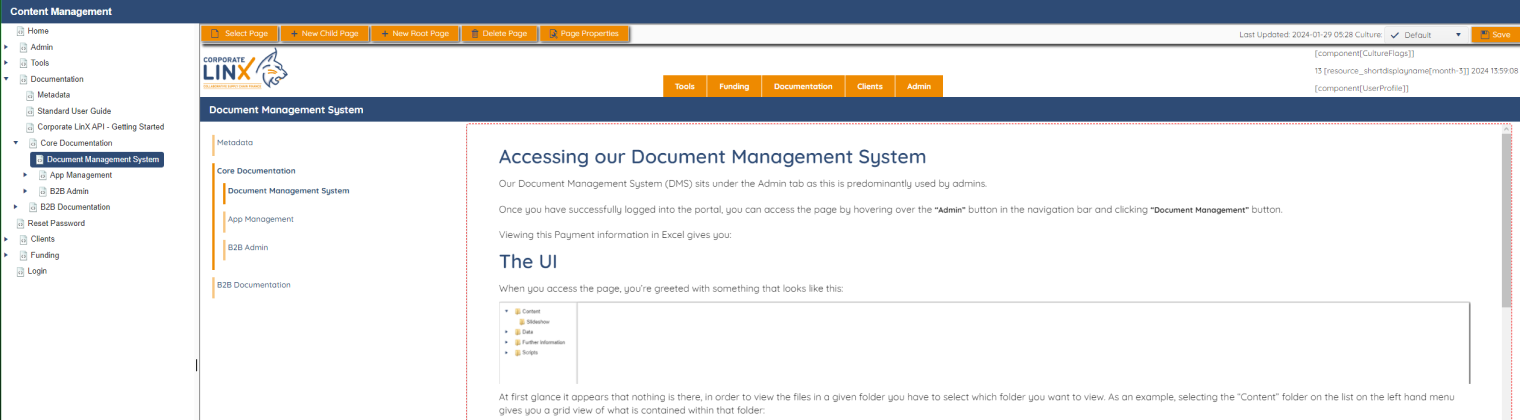
This is an editable view of the page that is selected, you will notice that the right hand side is an editable box that allows you to change any text on the page quickly and easily. There are also buttons on the top that allow you to perform different actions on the page.
Select a Page
This functionality is the same as that on the left hand menu - it allows you to select the page you would like to edit. Clicking on the “Select Page” button will bring up a dialog that looks like this:
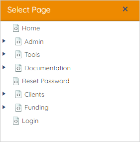
When you select a page on this dialog, it will load in an editable format allowing you to make changes to it quickly and easily.
Creating a Page
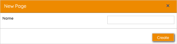
New Root Page
Clicking on the “New Root Page” button brings up a dialog that looks something like this:
Entering a name for your new page and clicking “Create” will create a new page with that name that is a root page, this means that it is typically a parent page that child pages will sit under. This means that the path essentially becomes Parent. For example, App Management is a root page.
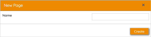
New Child Page
Clicking on the “New Child Page” button brings up a dialog that looks something like this:
Entering a name for your new page and clicking “Create” will create a new page with that name that is a “Child” of the page you’re editing. This means that the path essentially becomes Parent/Child. For example, App Management is a child page of the Admin page.
Updating a Page
Page Properties
General
Clicking on the “Page Properties” button brings up a dialog that looks something like this:
src="https://dev.corporatelinx.com:443/Api/DMS/Content/Documentation/Core Documentation/CMS/NewChildPageDialog-en.png" />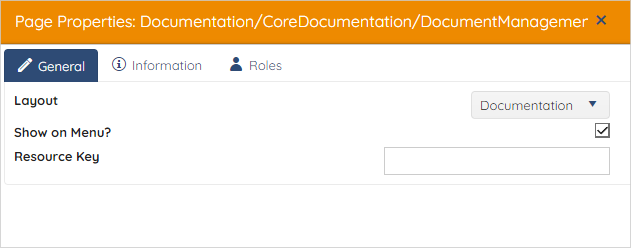
In the “General” tab contains the page’s general settings, including the “Layout” that the page uses, “Show on Menu” determines whether or not the page is shown in the navigation menu, de-selecting this will remove it from the navigation menu. The “Resource Key” field corresponds to the resource set you want to be used on this page, for example if you have B2B resources you need to use, then you would set this key to B2B.
Information
In the “Information” tab, you can manage a few things related to the page. You can set up the “Culture” which allows you to set the language of the page information, “Title” this is the title of the page, you can create new rows in the grid that will allow you to set up different translations of the page’s title.
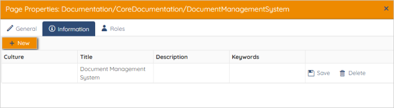
Clicking on the “New” will create a new row in the dialog, which you can fill in with the information you desire. For example, if you want to create a French translation for the page’s title, you’ll select “French (France)”from the drop down in the cultures column, and set the title to the French translation of “Document Management System”. This means that when the culture is set to French in the portal, the title will be shown as the French translation set here.
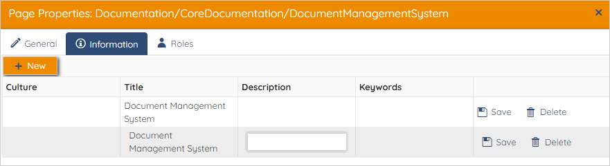
The “Description” and “Keywords” columns aren’t required, however if you wish to provided a description or any keywords that relate to the page you’re creating then they can be filled in here.
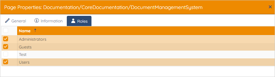
Roles
In the “Roles” tab, you can manage what users can see the page you’ve created, for example if it’s only relevant for Administrators, then you would assign only that role to the page so that only Administrators can view it. You can change these by selecting or de-selecting them in the grid.
Content Area
As you’re aware, the content area of the page, is an editable text box. When you click this, a toolbar appears that allows you to add text as you would in word and control the formatting of it. The toolbar looks something like this, and the icon in the top left of it allows you to freely move it around the screen for ease of use.


This tool bar allows you to modify any content on the page, for example the B button allows you to set the selected text style to bold, I allows you to set the selected text to be itallic and U allows you to set whether or not you want that text to be displayed underlined.

The next two buttons that contain the arrows allow you to undo and redo any changes you’ve made in the content. Allowing you to quickly revert any mistakes you may have made along the way.

The group of three buttons following the undo and redo buttons allow you to control the text alignment on the page. You may recognise these things from programs like Microsoft word. The left one allows you to align text to the left-hand side of the page, the middle button allows you to centre-align the content on the page and the third button allows you to right-align the text.

The first button of the next group allows you to embed a link on the page, clicking it opens a dialog that looks something like this:
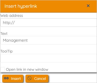
The “Web address” box need to be populated with the link you want on the page, the “Text” box needs to be populated with the text you want to replace the link with (ideally this needs to be relevant to where the link will take you). “ToolTip” will provide any extra information to the user when the link is hovered over. Selecting the “Open link in new window” will ensure that when the link is clicked, it will open it up in a new window as opposed to directing them away from the page that they are looking at. To confirm your choices and to embed the link onto the page within the content, click the “Insert” button.

The next, non-greyed out button is used to embed an image on the page, clicking this button opens a dialog that looks something like this:
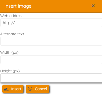
The “Web address” is the link where the image can be found, for example, to get an image from DMS in the current portal, this link will need to look something like this:
https://dev.corporatelinx.com:443/Api/DMS/Content/Documentation/image.png
The “Alternate text” field needs to be filled in with a brief description of the image, as this will be displayed if the image can’t be displayed for some reason. The “width” and “height” fields need to be populated with the desired width and height (in px) of the image you’re placing.

This button allows you to create a table in the content area, clicking on this button gives you a dialog that looks something like this:
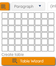
When you hover over the boxes, you will see a different level of highlighting, you can use this to determine the size of the table that you want. By highlighting the appropriate number of columns and rows and simply just clicking. This will then create an empty table in the content area which you can then add content to. However, if you wish to have more control over the table’s styling you may want to create your table using the “Table Wizard”. Clicking this button will bring up a dialog that looks something like this:
Table Tab
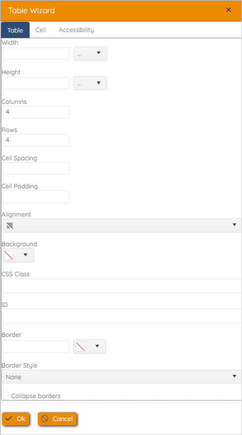
“Width” here determines the total width of the table in px, and “Height” determines the total height of the table. “Columns” is used to set the total number of columns in the table and “Rows” will be the total number of rows. The “Cell Spacing” refers to the amount of space you want there to be between cells (in px) in the table and the Cell Padding”“ relates to the padding (white space) around any content within the cells in px. “Alignment” allows you to set up how you want the text to be aligned within the table’s cells. “Background” allows you to select a preferred background colour. The “CSS Class” field can be populated with a known CSS class, which may define the “default” table formatting in the portal you’re in, setting an “ID” will allow you to easily select this element using CSS to apply any specific styling you want to it. “Border” accepts a value for the border width (in px) in the text box, this determines the “weight”/thickness of it. The colour picker next to this field allows you to specify a preferred border colour for the table you’re creating. “Border Style” allows you to specify the style of border you’d like, whether you’d like it to be dotted, solid or dashed for example.
Cell Tab
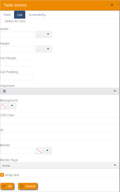
When “Select All Cells” is selected, any changes made and confirmed within this dialog will be applied to all cells within the table you’re creating. “Width”> and “Height” here apply to the cells only and not to the table as a whole. This is useful when you only want one or a few cells within the table to have differing styles. All of the styles that can be set in this tab apply only to the cell you’ve selected and not to the whole table like in the “Table” tab. When “Wrap text” is not selected, it will mean that the text does not wrap onto new lines when reaching the limits of the cell size.
Accessibility Tab
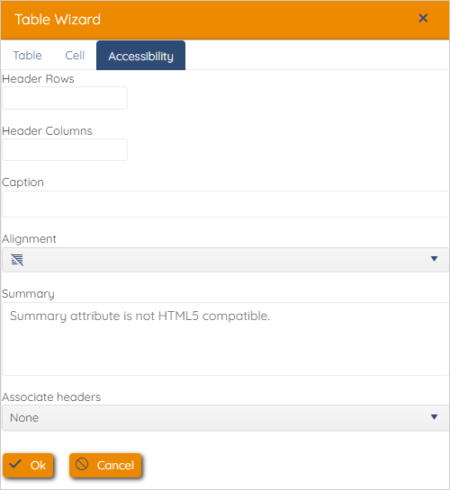
These settings enhance the table’s accessibility, the “Header Rows” and “Header Columns” determine how many header rows and columns there are in the defined table. “Caption” should provide the user with a concise explanation of the information that is displayed in the table you’re creating. The “Associate headers” determine links between the header columns and rows and how you expect them to be linked to one another.
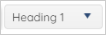
The dropdown with the text “Heading 1” allows you to set the “tag” of the content, for example “Heading 1” would be representative of a main heading and the content would usually be contained in
html tags. Setting this to “Paragraph” would ensure that your text is the same style as typical main body text.
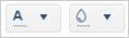
The first colour picker allows you to select what colour you would like the font to be displayed as and the second colour picker enables you to specify a highlight colour, if you want the text to be highlighted.

The final button in the toolbar is the “View Source” button, when you click this it comes up with an editor that looks something like this:
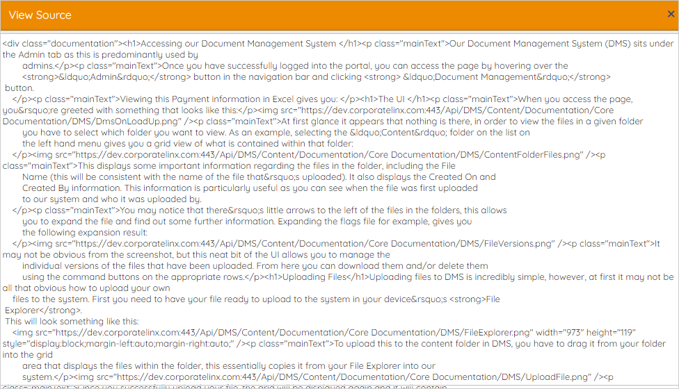
This editor is particularly useful if you would like to input content on the site in the form of HTML and it is where it can be placed such that the content within it is displayed on the page you’re editing.
Deleting a Page
To delete a page from the system, you click the “Delete Page” button from the toolbar at the top of the page. This will remove the selected page from the system and it will no longer be visible in the UI.