Corporate LinX - Documentation Library
Accessing Component Management
You Access this page through the App Management Tabs. From here you can manage any components that are specific to the app that you’re working in. This should have a very limited number of components in it as the majority are Common Cached.
The UI
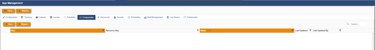
When you access the components tab, you’re greeted with something that looks like this:
The reason this grid is empty, is because all of this app’s Components live in the Common cache. However, it’s still important to understand how to use this functionality should there ever be anything that only needs to exist in this app.
Creating a Component
To create a new component in this UI, you click on the "New" button in the header bar. Clicking this will bring up a dialog that looks something like this:
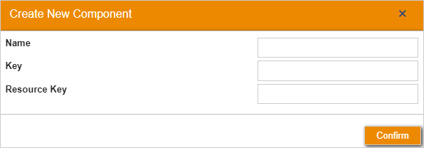
Here, “Name” is the name you want your component to have that needs to be related to the contents of it and its function. “Key” is the way that we split the components into sections, for example we have components with the key B2B which contain all things relating to company data and transactions. “Resource Key” is the way that the system selects which resources to use in this component. For example, if this is set to B2B, it will use the resources that have the matching key. Once you’ve filled these text boxes in with the relevant information, you can press confirm to create your new component.
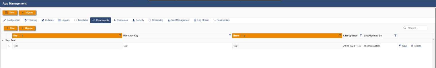
For now, I have created a Test component. On this row you can see that there are save and delete functions and there is the ability expand the component.
Updating a Component
On expanding a new component, you will come across 2 boxes in which you can implement your component code. It is broken down into two parts, HTML and JavaScript. In which you can view the code that already exists and make any changes you want to.
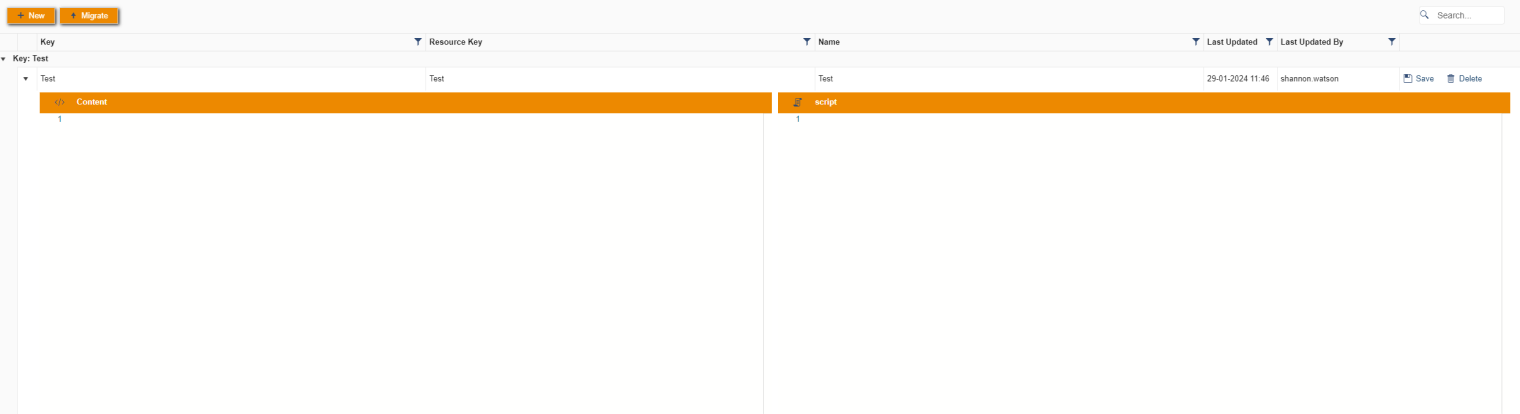
The left box is where you implement the html breakdown for the component and the right hand box is where you implement the JavaScript code. Once you’ve made your changes in either of these boxes, you click the “Save” button on the relevant row. This will save any changes you’ve made to this component.
Deleting a Component
To delete a component that you no longer use or need, then you click the “Delete” button that will remove your component and its content from the UI.
